- 27 January, 2022
- 12 Minutes
Rotation | Prologue
A technical tale sequence covering the development phase of my best-selling app for Android.
A development story depicting some technical aspects of my app Rotation, which has proudly served the Android community since 2014.
Abstract
This post describes the conception and initial development of the Rotation Android app, beginning in 2014. It explains how a system bug on Sony devices, which prevented proper settings control, inspired the core idea of overriding app orientation. The increasing size of mobile devices at the time highlighted the growing need for better orientation management, particularly on a per-app basis. A market analysis revealed existing solutions had outdated interfaces, encouraging the developer to pursue a modern, design-centric approach. User feedback from previous projects further validated the demand for such an app. The developer’s unique workflow involved starting with the app’s icon and branding before moving into the coding phase. Interestingly, the initial icon was created using basic tools like Paint and PowerPoint. The design philosophy focused on aligning with the Android system’s look and feel to minimize user learning. Both light and dark themes were incorporated from the outset. Development was carried out using Eclipse with ADT, leveraging Java and XML. The app launched in July 2014 as a 7-day trial, requiring a separate paid app to unlock its full functionality. Rotation’s feature set extended well beyond simple orientation control, including customization, themes, backup/restore, and automation. The post concludes by foreshadowing future challenges related to monetization, adapting to evolving Android APIs, and maintaining the app’s presence on the Google Play Store.
Origin
In early 2014, I was about to complete my bachelor’s degree and published around 10 apps on Google Play. Although I had only just completed the foundational early phases of Android development, my excitement and passion motivated me to tackle a much bigger dream. Hence, Rotation became the forefront of such technical ambitions which I wanted to tackle and deliver to the world. The combination of drive, passion and other aspects of this relatively young mobile industry, collectively inspired me to begin my ambitious project. However, I could never have imagined that Rotation would lead to an endless, exciting, and challenging career path.
A bug in the system
Prior to Rotation, I had developed a small app for Sony devices to toggle the system auto-rotation. However, due to a bug in their system, I was unable to write the system settings properly on certain devices. This led me to begin wondering if there might be some way to control the device orientation regardless of the app, and hence the vision was born. I tried to go deeper and found that it is possible by using the overlay via WindowManager API. Fortunately, I had been familiar with these APIs, as Sony’s small app framework was also using them under the hood.
Devices getting larger
Controlling app orientation has always been a challenge for users having larger devices. I was fully aware of this situation and sometimes an app changes orientation unexpectedly which can ruin the user experience. I begin realizing that developing a per-app-based system would be highly beneficial to users, and would also encourage other app developers to support various orientations if the popularity of apps like Rotation were to increase. This intuition is precisely what ended up happening over the years. That is, as the popularity of mature and robust apps like Rotation skyrocketed to the top of the charts, increasingly we have seen other developers begin their own journey in this arena.
A room for competition
As additional research, I had done some quick searches on Play Store to find and analyze any existing solutions. Interestingly enough, I found a few orientation apps, with not-so-modern user interfaces. In those earlier years, many such developers were still focused more on the User Interface (and not the User eXperience). Hence, this discovery added further confidence in the planning and moving forward of Rotation as there was room for survival. I was confident that if I designed Rotation to be aesthetically modern and abiding by the latest design guidelines of Google, then Rotation would carve a great new path and gain that much more desirability and popularity on modern worldwide devices, and this is precisely what we witnessed happening for Rotation on Google Play.
Some existing users
Some users from my prior apps had also contributed great suggestions by recommending a solution that would extend the functionality of my Sony small app further, just as I had been thinking of doing all along. This of course helped add further reassurances that my ideas for Rotation were heading the right way for consumers.
I sometimes still get surprised when people send an email or provide Play Store reviews hinting at the unexpected use case scenarios for Rotation, which even I had no idea about at the time of development.
Initialize
Interestingly enough, I have never designed a mock-up for my own apps. Therefore, the reader is likely wondering how I can be managing so many challenging aspects of my apps in real-time and all alone? Well, initially it would have been a time-consuming overhead for me to code in terms of design mock-ups. However, designing a mock-up is the ideal and recommended way for development, if one has a team of dedicated full-time developers assigned to various aspects of a project. However, as I am an independent developer and faced with the challenge of handling many things by myself, naturally my workflow and ways of tackling various challenges are unique and different. I generally start by designing a product icon and selecting the branding colors and themes, and then it becomes easier for me to code with respect to these two aspects in mind.
It’s also important to note that since the inception of Rotation, the engineering infrastructure for all of my apps has been meticulously crafted to be ready for compliance with the dynamic theming capabilities introduced since Android 12.
Icon
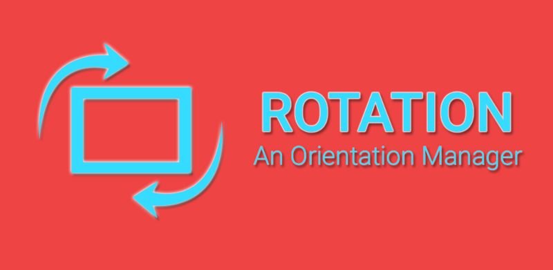
The initial icon of Rotation was just a rectangle surrounded by two arrows and was built using a combination of Microsoft Paint and PowerPoint. Wait…what? Yes, you read that correctly. Since I was using these two things a lot when creating presentations for my college, I did not try to break the flow. As I was still kind of a beginner in designing graphics, the earlier designs were not as impressive as they would become later but were still good enough to get things started.
A great engineer should take a pledge to never judge anyone based on the technology stack or tools they are using. You never know their perspective and circumstances! So just try to find the best ways that suit the situation.
Today, we have a lot of great free tools available that are easily accessible to everyone. Hence, chances are rare that one would ever need to resort to extreme workflows. I simply share my own personal experience for educational and motivational purposes, as a means to show that even one person can accomplish a lot! Many developers may complain about the languages, tools, stack, etc. But in the technical world, experience has proven to me that:
Nothing is perfect but can be better!
It’s very easy to be critical and start finding issues in a software product or tools. You just need time and motivation to begin the change!
Design
The original Material Design was announced at Google I/O in 2014 and we had a glimpse of the upcoming overhaul with Android L or 5.0 (Lollipop). The official support libraries were nowhere near their current state and all the developers were trying to mimic the mock-ups by using the existing resources. There were lots of changes in Android 5.0 and what you see today is all started with that iconic release which had its own flaws leading to a rewrite of the animation system in Android 6.0 (Marshmallow).
Coincidently, we have another
L(Android 12L) release around the corner when I am writing this journey.
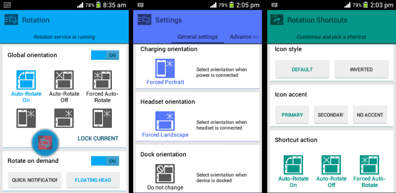
The major innovation from a design perspective has been a light system theme, similar to Android 2.2 (Froyo). However, in those days we had a habit of using a darker theme which we were used to since Android 2.3 (Gingerbread). As an indie developer, such design shifts were challenging because I already had several apps on Google Play which were using a dark theme. I just wanted to build my next app around the same look and feel that I had engineered. Finally, I decided to include both light and dark themes available from the onset of the release of Rotation. I was unaware that this emotional decision would cost me a considerable amount of time as my expectations were quite high and I did not want to limit that to just a few static colors.
Inspiration
Since the engineering concepts behind Rotation were quite technical in nature, I wanted to keep the design closer to the system which would thereby also help minimize the learning curve for the users. The initial results were adequate for a while but later followed by a complete overhaul in 2018.
Such deep analyses paved the way for the development of the dynamic theme engine, which I am using in my apps since 2019.
Commit
I had a design in mind and was figuring out the best development approach to make that happen. The fortunate thing back then was that we didn’t have a plethora of choices to consider. Although choices can sometimes provide certain advantages and options for development, beginners can get quite lost if there is no clear path of knowing when to choose what.
Eclipse with ADT
Android Studio (the official IDE for Android) was still in the beta stages even after a year of its official announcement in 2013. Fortunately, I already had a fair amount of experience with Android Developer Tools, which enabled me to continue using that for my next app. The other reason for not being an early adopter was not having a powerful machine, especially an SSD. The Gradle build system was new to us and it had its own conveniences, but some shortcomings too. The significant amount of time required just to initialize, open or build a project was difficult to bear and demoralizing. Additionally, when you are a self-taught independent developer, even the smallest distractions and inefficiencies take away a lot of motivation and can lead one to often wonder if our code has some inherent inefficiencies, or might be entirely impossible to build on our available development machine.
The Eclipse IDE had a lot better experience at that time, so I just created a new project inside that for the sake of better stability and productivity. It also loaded my projects instantly and was working quite well on my machine with average specifications.
Last time I used Eclipse with ADT was in 2020 (for my initial projects), but later I migrated everything to Android Studio.
The Java programming language and XML
I think it’s difficult to imagine Android without Java and an app like Rotation would not be possible with hybrid or any other approach. I still rely heavily on Java for my major projects and they all are working quite nicely even on Android 12L devices.
XML is another thing that is still prominent in the Android ecosystem and back then we had this only choice to design the layouts too. It took me fairly less time to design some complex layouts by just using the XML system and they still play a vital role in my apps and open-source projects. Now, we have various alternatives, and they all have certain advantages; however, choosing the right one according to requirements can be a time-consuming endeavor, so I am still following the good old base I have built (over the course of 8 years) and gradually trying to update with better alternatives.
Resisting a major change is human nature and it’s even more evident in the technology world where so many intricate components are linked together. Fortunately, I think this is also the major reason all my apps still support Android 4.1 (API 16) all the way up to the latest Android 12L (AP 32). Sometimes, not re-inventing the wheel keeps us more productive as well.
Publish
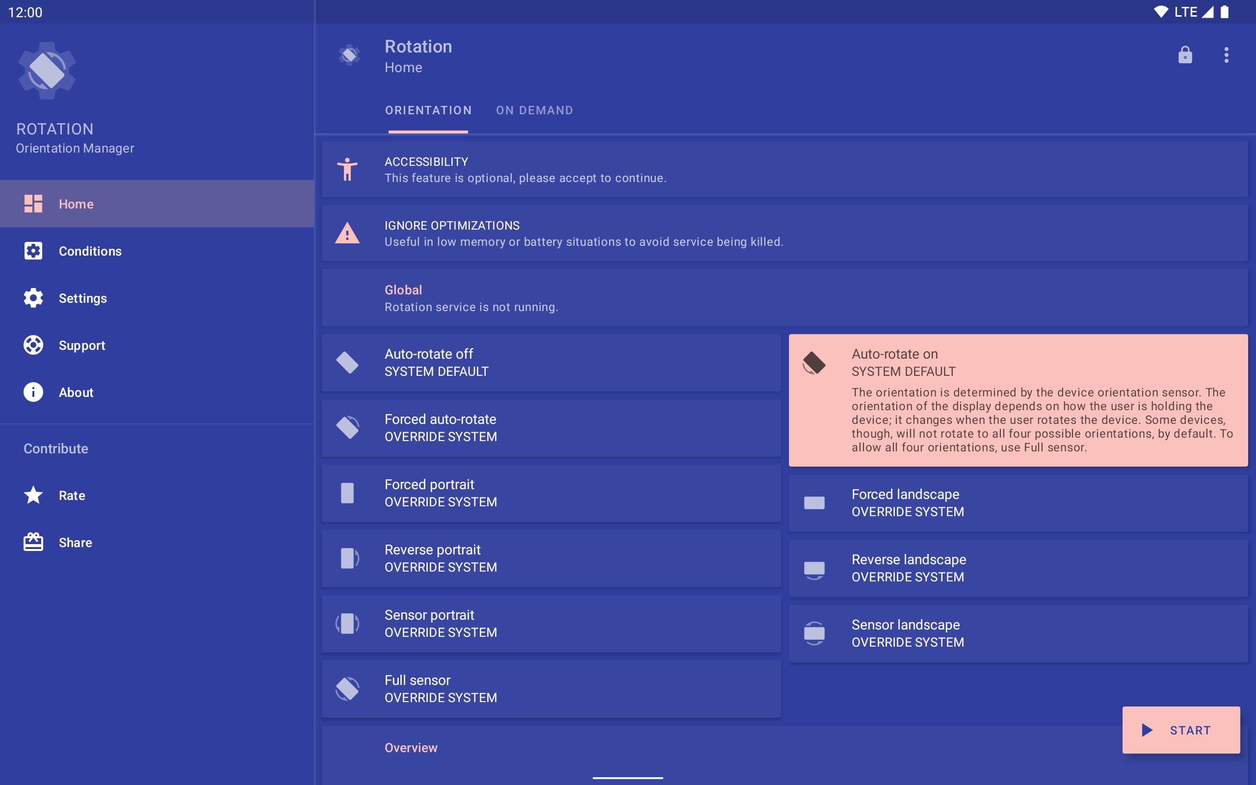
After some rigorous experimental labor and efforts, I was able to build an initial version of Rotation which managed to surpass even my own expectations! It had so many features apart from its core functionality (orientation manager) like the various customization possibilities, dark/light themes, backup/restore, floating head, notification, widgets, shortcuts, automation and many more. This is why Rotation has not only become very popular on Google Play (although I still work hard for continued success), but Rotation also serves as a rich reservoir of experience that I can draw from and apply to other important projects.
7-day trial with a Key to unlock
In July 2014, Rotation went live on Google Play as a 7-day trial with a separate paid app (Key) to unlock it for an unlimited time period. This decision was unexpected as I was moving along with the competition and later I switched to the freemium path to make it even more accessible. That transition was tough and it left me in the dilemma, even today I am not sure which of the path was actually better but the amount of time I have invested in Rotation is just beyond the limits.
I still wonder how I built Rotation from scratch with just barely over a year of programming experience. Sometimes, you just need to keep doing things that you like the most and I still aspire to create more Android apps with even better experiences.
A storm was waiting
That was exactly the launch I was expecting but it’s still difficult to predict the outcome without building the product. Things were good in the beginning and I was happy with what I did in a short span of a few months. It even got featured on various blogs including XDA but the business model could be better and the constant Android API changes were also demoralizing for an app like Rotation. It took endless efforts to keep it live on Google Play and I wish to share that struggle someday.
Review
This post was reviewed by Alexander Madani, the developer of the EZ Notes app which is indirectly connected to this world. I hope you will be able to experience that journey too.
Related Posts
- 26 June, 2017
Dynamic Utils
- Pranav Pandey
- 7 Minutes
Utility functions to perform dynamic operations on Android.
- 18 March, 2019
Create bitmap from a view
- Pranav Pandey
- 3 Minutes
Create a bitmap from the view on Android.
- 06 November, 2019
- $0/m
Pokémon Sidekick
- Pranav Pandey
- 3 Minutes
A live wallpaper port from the Google Pixel 4 devices.
- 08 November, 2019
Rotation | Orientation Manager
- Pranav Pandey
- 5 Minutes
A tool to manage the device orientation on Android.
- 09 November, 2019
Everyday | Calendar Widget
- Pranav Pandey
- 3 Minutes
The missing link in between your calendar and widget on Android.
- 15 November, 2019
Dynamic Dialogs
- Pranav Pandey
- 4 Minutes
Display improved dialogs and dialog fragments on Android.
- 13 December, 2019
Palettes | Theme Manager
- Pranav Pandey
- 2 Minutes
A universal manager for apps supporting the dynamic theme on Android.
- 13 August, 2021
Zerocros | Tic-tac-toe Game
- Pranav Pandey
- 1 Minute
A simple yet customizable tic-tac-toe game for Android.
- 15 January, 2022
Barquode | Matrix Manager
- Pranav Pandey
- 3 Minutes
A tool to create, capture and manage matrix codes on Android.
- 05 December, 2022
- $5/m
Dynamic Ads
- Pranav Pandey
- 10 Minutes
Show GDPR-compliant ads via Google AdMob on Android.
- 04 February, 2024
- $0/m
Dynamic Theme
- Pranav Pandey
- 19 Minutes
The development story of a text (JSON) based universal theme engine for Android.
- 20 July, 2025
- $0/m
Rotation | Abstract
- Pranav Pandey
- 6 Minutes
