- 20 July, 2022
- 17 Minutes
Rotation | Epilogue
A technical tale sequence covering the reboot of my best-selling app for Android.
The reboot depicting some technical aspects of my app Rotation, available for Android since 2014.
Abstract
This post chronicles the significant overhaul and subsequent success of the Rotation Android app. It details the developer’s 2017 decision to completely rebuild the app, driven by the need to adapt to evolving Android APIs, maintain backward compatibility, and create a reusable framework for future projects. The process involved overcoming numerous technical hurdles, including modularizing the codebase, implementing dynamic UI elements, and creating custom support libraries. The developer embraced open-source principles, sought community feedback, and strategically introduced non-intrusive advertising. The app’s design was refined in line with Material Design principles, and localization efforts expanded its reach to ten languages. The result of this extensive reboot was a robust and popular app, boasting over 500,000 downloads. The article concludes with the developer reflecting on the eight-year journey, highlighting the lessons learned, the importance of perseverance, and the satisfaction of building a successful product from the ground up.
Reboot
After gaining valuable experiences from my initial struggles, in early 2017, I decided to rebuild Rotation from scratch with extensibility and scalability in mind which would tackle the continuous API changes as well as support the older Android versions. That decision was again an emotionally challenging one as I was about to abandon the app but it has allowed me to create a robust base for my future apps and not just benefit Rotation alone.
Source
Building a software product again completely from scratch after around 4 years from its initial launch is something that doesn’t happen very often in this industry but I have never thought that Rotation would serve as a rich reservoir of experience that I have drawn from and applied to several other important projects. I decided to modularize it in such a way that I would be able to use it in my future apps in cases where other ideas and inspirations strike. I truly believe in open-source projects and helping others, because I too have learned a lot from this community. In fact, I already had a plan to open-source most of the stuff so that others can learn, develop and improve upon the ideas. The development plan was there but executing it was still a challenge as I was all alone in this journey and had to manage a lot of things that were not related to programming.
It’s easier to write code that’s static or limited to a particular project but it takes a lot of time and thinking to make it dynamic and generalized for all.
The lost community
Due to this unexpected and major decision about the future, I was in dire need to get some real feedback from the users to make sure that I was on the right track as the development would progress. Hence, I created a community on Google+ as it was the most appropriate source to get stuff related to Android development at that time and it also had a deep integration inside the Google Play Console to manage testers. Luckily, I got some testers there who were willing to try the whole new experience that was awaiting them. I will always be grateful to those initial testers and volunteers who helped in shaping the future of Rotation.
Destiny
In 2018, I met Alexander Madani on Google+ while trying to help people in the official Android community. He was working on his app EZ Notes and since then I am supporting its development. Later, EZ Notes was overhauled and built on top of the open-source projects that I built during the development of Rotation. He has also supported this journey financially and I will always be grateful for his contributions. I will share more about that parallel phase that has helped greatly in shaping the future for all.
Ads
I was already giving away a lot of unique features for free after taking a tough decision in the past but this time I was going to bear the development cost again. So, I introduced non-intrusive ads via Google AdMob to keep generating some revenue from the free users. As Rotation works in the background most of the time, the users welcomed this decision and supported the development further.
Translators
Before the reboot, Rotation was already available in 6 languages other than English and that was a major concern too. Those translations were done by volunteers and tracking them again was a challenge. I didn’t want to force trouble them to go through the translations all over again. Hence, I had not been aware of the initial phrases that would be required by this reboot process. Therefore, I just put a notice inside the app that more translations will become available later. After getting the initial development versions of Rotation, some of those translators reached me and I tried to contact the remaining ones. Later, I was contacted by more volunteers and today, Rotation is available in 10 languages and that’s only made possible because these supporters helped me greatly in making this complex app available in their native languages. I give them the promo codes of my paid apps as a token of respect that I will always have for them as it’s difficult to do work for others without expecting financial support. This is one of the primary reasons why I always try my best to work for the community and make my projects easily accessible for all.
All of my major apps feature a translators section, so as to give credit to their contributions. Also, the translations are done by the community, so I have made them available for everyone to use in their projects.
Rebuild
This time, I was about to invest a lot more time in each and every aspect of the new roadmap, after having learned so much from my past experiences. Of course, things were quite daunting at first, but somehow I managed to remain resilient enough to keep moving forward in the right direction. There were lots of challenging areas to tackle, and it took lots of effort and self-motivation to make things finally happen. Since the beginning, I’ve had some dynamic kinds of approaches in my mind and I tried my best to implement them in most areas including the icons and overall app design.
Inspiration
We had the initial version of Material Design released by Google, and I decided to think about extending them accordingly. After several iterations, I was able to build an image for my future apps, that would not just be limited to Rotation. In fact, the same design was also featured in the latest Android release at that time i.e., Android 5.0 (L). Hence, I decided to stick to those principles because I was thinking it would help minimize the learning curve for a complex app like Rotation. My initial goal was just to blend it well with other system apps to minimize the in-app tutorial and guidance.
Eventually, it did help in attracting more users after some final touches were introduced, sometime around 2019.
Icon
By now, I had enough experience to design some good graphics in professional tools like Photoshop and Illustrator, so I just moved forward with that setup. The Material Design team was also releasing the supporting resources for them, so it made the designing process a lot better. This time I wanted to achieve my ambitious and dynamic dream in terms of designing too, so I was aware that it might require multiple variants of the app icon. After several iterations, I came up with three variants of the app icon including a monochrome one which I used extensively throughout the app to tint it according to the selected theme.

Themed
Perhaps it’s just a coincidence, but most of these aspects are featured in Android 12/13 via Material You and themed app icons. My apps still use the custom implementation that I built during this reboot but they are fully capable to use the official system implementations as well.
Design
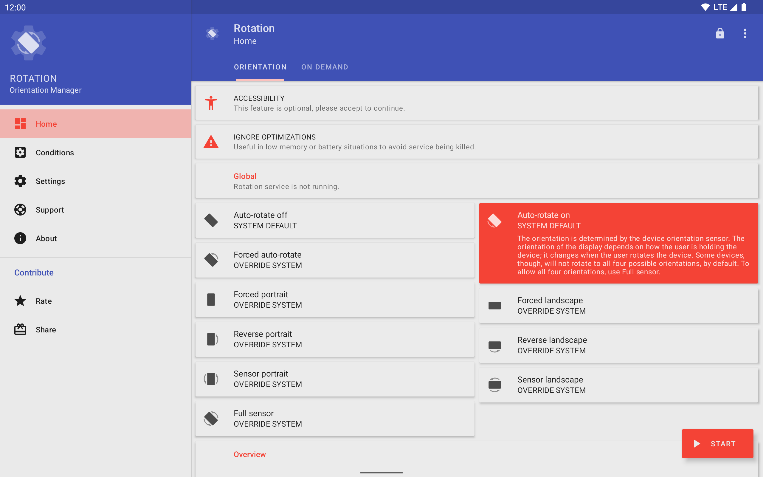
By now, we had a completely evolved and mature Material Design system by Google, so I decided to make full use of it. The navigation drawer from the older versions had returned with some optimizations done to the menu items. I tried to categorize similar things together into tabs and tried to explain complex settings as well as possible. By default, an Android setting generally has a title and subtitle, but I have introduced a description as well, to explain more complex aspects of Rotation. This practice has greatly helped in reducing the tutorial & support documentation, and providing real-time information to the users as well.
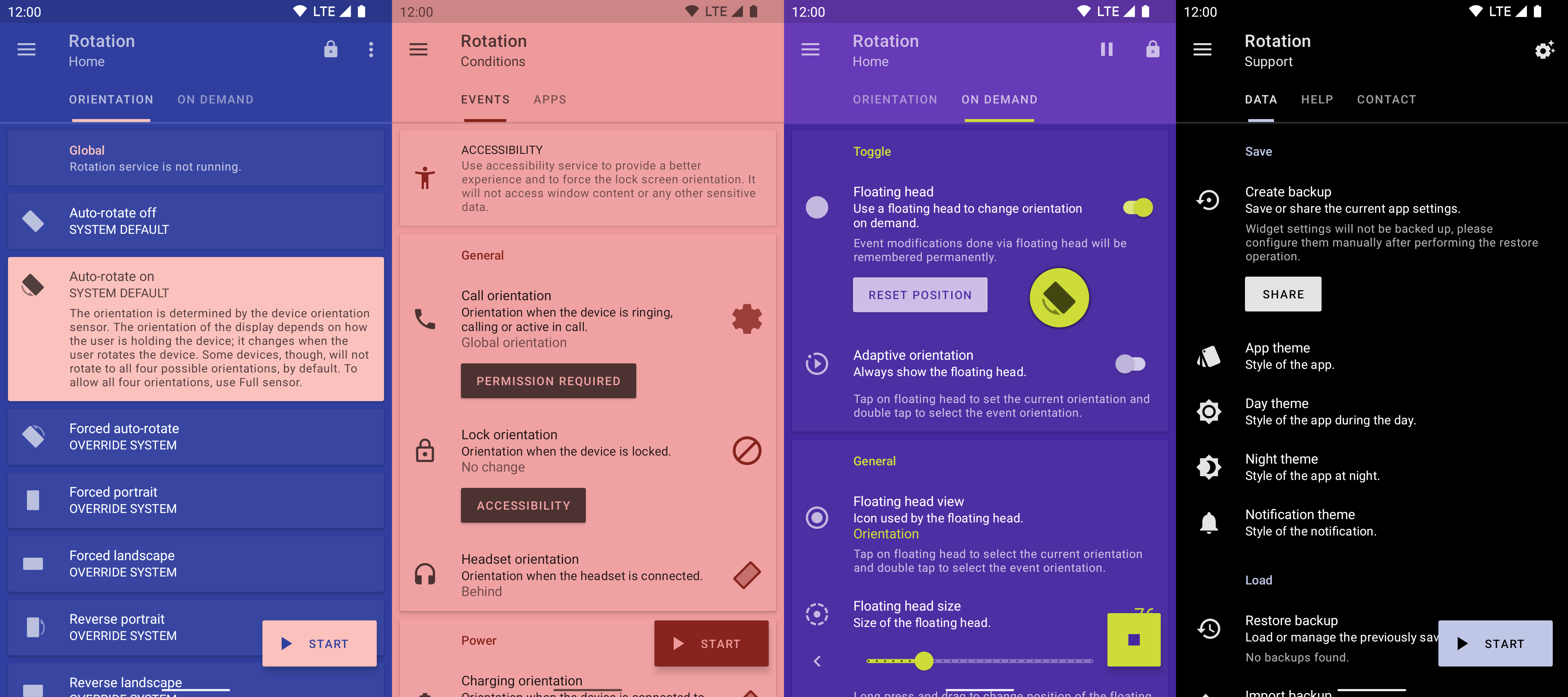
I redesigned all the orientation icons to keep them as close to the default guidelines of Material Design and provide them with a more professional look. Although, I had something different in my mind to make most of the UI aspects dynamic, some default branding was also required to make things standardized. So, I adjusted the branding colors too to make them feel more natural and attractive by using shades of indigo and red colors. The core idea was to be in tune with human psychology, where we use Blue and similar colors to represent trust, and Red to make things stand out. The combination of these two worked quite nicely, as Rotation uses various sensitive permissions. Moreover, by then we had other competitors in the market as well.
A responsive tutorial
After taking the lessons from the past tutorial, I tried to reduce the number of pages and simultaneously made them responsive so that users can perform important actions in real-time. The most important action by users is to start the Rotation service first, and then select a global orientation which serves as the default orientation when no other custom setting is available. I included this information on the second page, just after the welcome message so that the users could immediately understand it. Later pages had information related to the conditions and various other settings but were not immediately required.
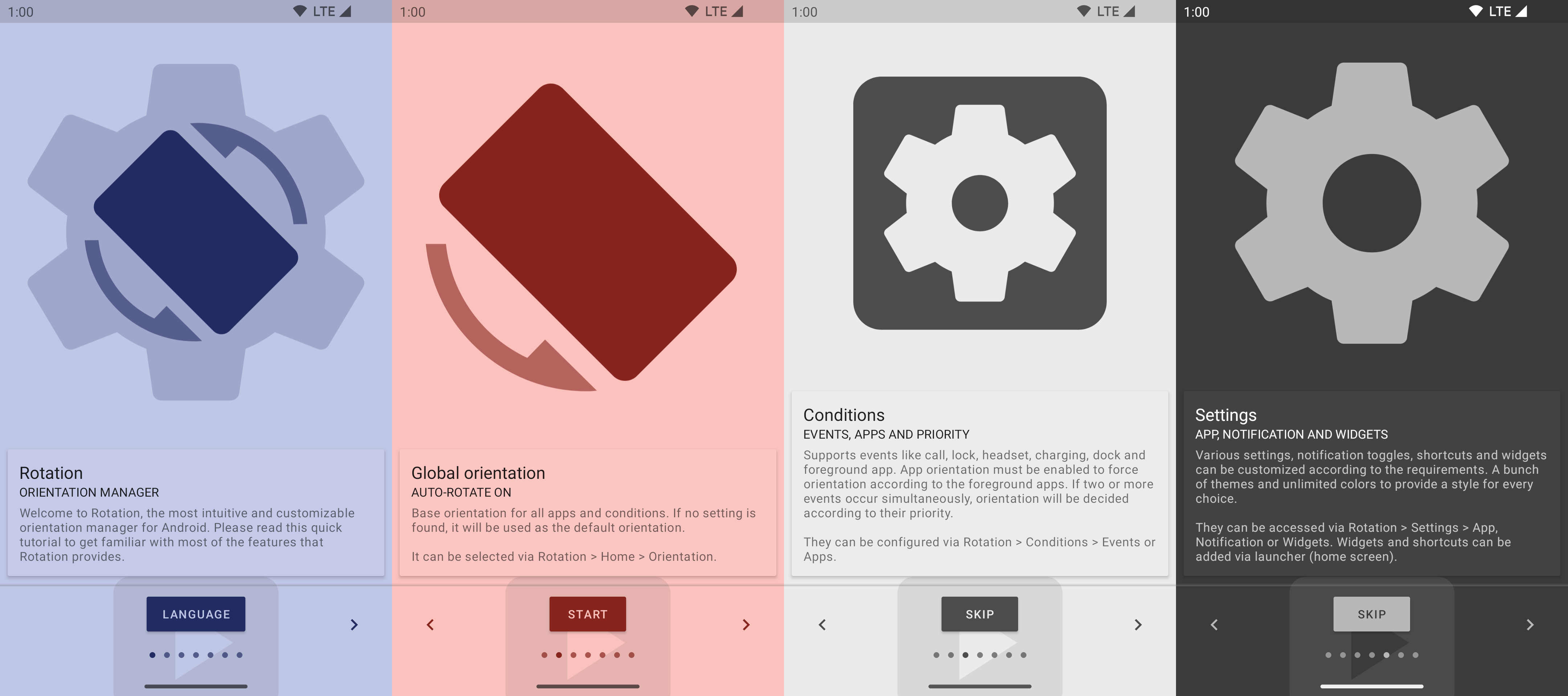
This time, I really wanted to explain things more thoroughly to my users before actually allowing them to use the app, that’s why I have included another checkpoint in the form of a
setuppage to configure the important settings again, in case they somehow missed them during the tutorial.
Migrate
When we work with Google technologies, migrations are uncertain and sometimes things become so complex that they need a lot of refactoring. I had already experienced such behaviors before, so I wanted to have some kind of control over my code in case these were to manifest themselves again in the future. Migrations are part of the technology world but doing them too often makes things impractical for an independent developer like me. Google is a huge data-driven organization divided into several smaller teams working on independent yet connected projects. It’s always difficult to predict outcomes in the beginning, and often projects don’t follow the same path for very long. The developers tend to abandon things, iterate on others, and build up again, resulting in migrations and various alternatives to achieve similar results.
I often wonder how a
WindowsorJavaprogram written in the 1990s is still supported by their latest iterations.
Restructure
By 2017, I had enough experience and hardware to go with Android Studio. Practically speaking, there was no other option to build an app like Rotation. This time, I was about to take a modularized approach by dividing the project into various sub-modules according to their functionalities. Luckily, this approach was well supported by the IDE and Gradle build system. I was confident that at least the project structure would be stable for a longer period of time as Google was committed to this 3-year-old official IDE. We also had some unofficial plugins to use the Kotlin programming language instead of Java but I had not taken that path as Rotation was already a complex project and I didn’t want to deal with a completely new syntax at that time.
Following their typical habit and taking inspiration Swiftly from another world, later in 2019, Kotlin became the official language for Android. Now I was once again in a state of dilemma about the future of the Java programming language in Android. We had an all-XML trend instead of no-XML at that time, so I followed the same approach to design layouts and do other related stuff. The other benefit was to be able to reuse and iterate over the older resources that I had built over a span of 3 years.
It’s easier to get lost in this
toolkitworld but the thing that matters the most is how we select and organize them together according to the requirements.
Dynamic
Since the beginning, the most loved aspect of Rotation is its customization capabilities which provide the ability to tweak the functionality on-demand. Whether it’s per-app settings, various events like call, lock, headset, charging and dock or a floating head that appears on the top to change orientation with a tap, all are greatly appreciated by the users. I decided to take this approach to the full extent, by providing a fully customizable user interface using themes. Unfortunately, there was no official support at that time for a certain kind of UI, but it was possible by building an interface on top of what Google was already providing. I did some quick experiments and was confident enough that this highly ambitious goal can be achieved by some rigorous development. Soon after, I started building a base for my future endeavors to make Android development better for all.

Support
While working on the job, I got some constructive feedback from my colleagues relating to UI/UX development and yet, it is the most time-consuming task, as we have to support lots of devices with various screen sizes and specifications. I was experiencing similar issues with Rotation and was trying to implement the dynamic aspects in the design too. So, I started developing a complete dynamic-support library with a built-in theme engine to address those issues and tested them in Rotation. I decided to build it on top of AndroidX and Material Design Components for Android to provide the best compatibility and responsiveness by default.
It is a collection of activities, fragments, widgets, views and some utility functions required to build a standard Android app. It also provides some built-in use cases like an intro screen, drawer activity, about screen, collapsing app bar, navigation bar view, color picker, multiple locales, runtime permissions, etc. which can be used and customized according to the requirements. This time, I was able to address the color-related challenges by developing a unique background aware functionality to adjust views according to their background to avoid any visibility issues, and hence provide color for every choice.
Toolkit
In 2020, Google announced Jetpack Compose, a new toolkit to develop UIs for Android using the Kotlin programming language. However, I instead chose to stick to my own libraries as Compose wasn’t mature enough at that time, and I had to support the older API levels (below 21) as well.
Utility
A dynamic design and functionality require some sort of mechanism to switch methods or API calls on demand. As Android has progressed over the years, and Rotation supports various API levels (14-33), there was a need for some kind of utility library to perform various operations based on the user’s device. This would also help in performing quick operations without leaving the context. So, I have developed the dynamic-utils library which is a collection of methods to perform various operations including color, device, drawable, package and SDK that can be used from anywhere within an Android app.
Having a library like this has greatly helped in transitioning from the
AsyncTasktasks, providing theedge-to-edgefunctionality and creating a utility class to generatecolorsat runtime.
Engine
Rotation’s core functionality resides in its service that runs continuously in the background and monitors various events and apps to manage the device orientation accordingly. Due to the continuous API changes and background restrictions introduced in Android 8.0, I have developed the dynamic-engine library to make this challenging task manageable on various API levels and devices. It is a collection of different tasks which can monitor various events by running a service in the background. Initially, it could monitor calls, lock, headset, charging, dock and foreground app related-events. This library has helped a lot in keeping the basic aspects separate from Rotation and helped in focusing on managing the screen orientation efficiently.
Later, I added the support for
accessibility servicewhich restored the lost lock screen functionality and helped in improving the battery consumption when detecting the foreground app. These two major improvements happened in the years 2021 and 2022 respectively, and thereby helped in improving the overall experience and growing the user base.
Toasts
Rotation mostly runs in the background and sometimes it notifies the user about the current status of the app or task by displaying a toast which can easily be neglected due to non-app-related UI being visible to the user.
So, I have decided to make them slightly different from the system toasts which can be easily identifiable by users. As a result, I have developed the dynamic-toasts and added color and icon functionality so that we can display different colors for different types of information and sometimes with icons also. For example, green color for success and red color for error. This library also addresses an AOSP issue in Toast API on Android 7.x.x (API 24, 25).
Deprecated
Later, in Android 11, it has become a standard and they have deprecated the custom toasts functionality.
Locale
Rotation has been translated into several languages other than English by the volunteers and one day I received feedback from the user asking to provide an in-app language picker to use it in a different language than the device’s default one.
PS: I have an enhancement suggestion too: would be nice to have an option to select the app language being different that the phone default.
We could do that for an activity via some custom solution but the major challenge in the case of Rotation was to change the locale of the whole app including the service (notification and toasts) and the home screen widgets. It took me some time to figure out this challenge, but I was able to implement it after developing the dynamic-locale library.
System
This is now a system feature introduced in Android 13 and Rotation supports that as well.
Iterate
By taking the above ideas and developing various libraries simultaneously, I started porting the existing Rotation features to this new architecture that was about to change the future forever. Initially, it took some time to gain pace but later it has given rise to some unplanned cool features in the form of dynamic-theme engine. Later, I introduced a dedicated support section within the app to troubleshoot various challenges that are bound to happen with an app like Rotation. It has vastly reduced the support emails as compared to those I was getting in the initial days and helped in improving the overall app rating.
Today, Rotation is available in 10 languages having over 500K downloads on Google Play. While it’s still not generating millions of dollars in revenues annually, nevertheless it now has a robust base to keep it alive as long as possible with minimum efforts.
Generally, epilogues tend to be shorter but in this unusual tale of Rotation, most of the good things have happened and the standards were set only after going through the rough campaign. These things are an integral part of a product journey and I think this final sequence is the string that connects a product to its success and takes it to the betterment.
This 8-year-long journey has never been about a single app, but to understand the process and how we build things from scratch. I hope it will help and inspire others to build something great!
Rotation was my first major app or project of any kind and it has taught me a lot about software development and business challenges. I wrote this tale to share the journey of its development which is filled with emotions and sacrifices that have taken a lot of time and struggle to overcome and conquer. This is not the end but the beginning of a whole new world that has even more stories to tell which I will try to cover in the future.
Review
This post was reviewed by Alexander Madani, the developer of the EZ Notes app which has its own journey. I hope you will be able to experience EZ Notes, and help support that developer and his community as well.
Related Posts
- 26 June, 2017
Dynamic Utils
- Pranav Pandey
- 7 Minutes
Utility functions to perform dynamic operations on Android.

- 18 March, 2019
Create bitmap from a view
- Pranav Pandey
- 3 Minutes
Create a bitmap from the view on Android.
- 06 November, 2019
- $0/m
Pokémon Sidekick
- Pranav Pandey
- 3 Minutes
A live wallpaper port from the Google Pixel 4 devices.
- 08 November, 2019
Rotation | Orientation Manager
- Pranav Pandey
- 5 Minutes
A tool to manage the device orientation on Android.
- 09 November, 2019
Everyday | Calendar Widget
- Pranav Pandey
- 3 Minutes
The missing link in between your calendar and widget on Android.
- 15 November, 2019
Dynamic Dialogs
- Pranav Pandey
- 4 Minutes
Display improved dialogs and dialog fragments on Android.
- 13 December, 2019
Palettes | Theme Manager
- Pranav Pandey
- 2 Minutes
A universal manager for apps supporting the dynamic theme on Android.

- 13 August, 2021
Zerocros | Tic-tac-toe Game
- Pranav Pandey
- 1 Minute
A simple yet customizable tic-tac-toe game for Android.
- 15 January, 2022
Barquode | Matrix Manager
- Pranav Pandey
- 3 Minutes
A tool to create, capture and manage matrix codes on Android.
- 05 December, 2022
- $5/m
Dynamic Ads
- Pranav Pandey
- 10 Minutes
Show GDPR-compliant ads via Google AdMob on Android.
- 04 February, 2024
- $0/m
Dynamic Theme
- Pranav Pandey
- 19 Minutes
The development story of a text (JSON) based universal theme engine for Android.
- 20 July, 2025
- $0/m
Rotation | Abstract
- Pranav Pandey
- 6 Minutes
